orkut
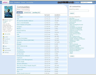
announced on August 23 that they will be rolling out a new look for their social network Orkut. Today, my account has been upgraded to the new design !!!
- Firstly, I would say that the new proposed look of orkut looks very neat and fresh.
- The blue and cyan color tones got a little bit more fresh and lighter
- In the new design, many of the edges have been rounded off for a smoother look.
- The custom, more playful first letter in Orkut style has been removed.
- The top bar wraps up some of the main functionality and integrates a search box.
- The three tabs social, professional, and personal moved a little bit lower, and look more traditionally tab-like than before.
- There’s some additional shades and gradients throughout the page as well.

 orkut announced on August 23 that they will be rolling out a new look for their social network Orkut. Today, my account has been upgraded to the new design !!!


No comments:
Post a Comment